With Q4 in full swing—Halloween, Black Friday, Cyber Monday, Christmas—there’s no room for error on your product and cart page.
You’re spending time and money driving traffic to your site; you don’t want to lose potential customers due to a simple mistake on one of the most important pages of your site.
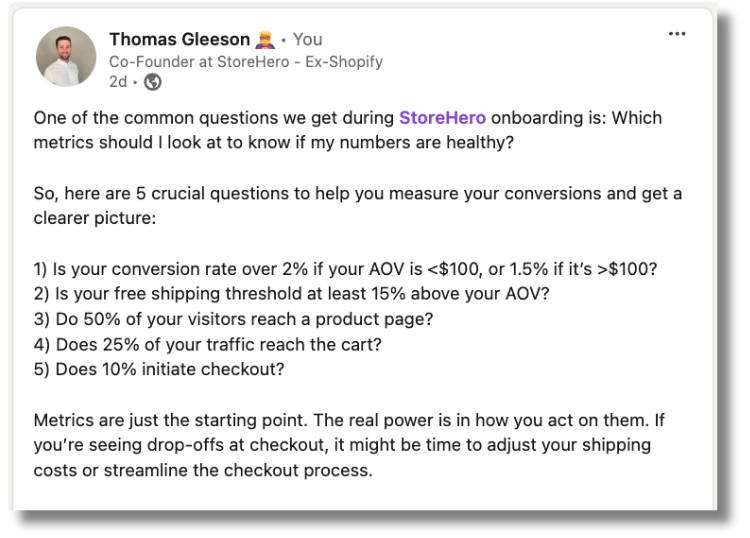
One of the main questions I always ask our clients is: when was the last time you did a full audit of your product page and cart? – Well, actually the full question is when wast the last time you audit your full website but let’s take it one step at a time 😂. – You’d be surprised at the answers.
Yes, your product page might be driving traffic, but is it driving sales and profit? That’s the real question.
Factors like over-discounting, shipping costs, or product bundles can significantly impact profitability.
Speed and efficiency: Getting your product page ready.
In this process of getting our product page ready for the high season, it’s common to want our website to look great, but a beautiful design doesn’t always mean a high-performing site. If you have the time to prepare it in advance, that’s fantastic—planning ahead is always best practice.
However, let’s be honest: in the fast-paced e-commerce world, getting your product pages ready for Q4 is all about speed and efficiency. As Ger Keohane from StudioForty9 pointed out in the episode Top E-Commerce Mistakes to Avoid- with Gerard Keohane | StoreHero Podcast.
This is especially critical during high-traffic seasons like Black Friday and Cyber Monday. Getting your product live on the site as soon as it hits your inventory maximizes your selling window and ensures you’re ahead of the competition.
While it’s tempting to perfect every detail on the product page, there’s definitely a case for when “done is better than perfect.” Don’t let perfectionism slow down your ability to capture sales early in the season.
30+ Key Tactics to Maximize Your Product and Cart Page Performance
To ensure your product and cart pages are ready for Q4—and ready to grow your profits, not just your revenue, we have prepared 35 questions to audit:
Product Page Checklist
- How descriptive are your product names/titles?
- Do you use a common product page layout?
- Is your primary product image a strong representation of the product?
- Do you include a gallery with multiple photos?
- Do you have images for different product variations?
- Is your “Add to Cart” or “Buy Now” button the most prominent element on the page?
- Is the price of each product clear and easily visible?
- Does your product page show any additional charges?
- Do you differentiate between a regular and sale price?
- Do you highlight shipping/delivery information?
- Do you address concerns with returns and refund guarantees?
- Do you offer express payment options?
- Do you include reviews or ratings on individual product pages?
- Do you use buttons for colors or sizes instead of dropdown lists?
- Do you include well-designed quantity selectors?
- Should you provide a size chart?
- Should you include technical specs, dimensions, or specific sizes?
- Is the product information clear and easy to read?
- Do you include free shipping and highlight it?
- Do you showcase both benefits and features?
- Do you use both long and short product descriptions?
- What happens when a user adds a product to their cart?
- Do you include cross-sells and upsells?
- Do you build urgency or scarcity on the product page?
Cart Page Checklist
- Does your cart save products between visits?
- Do you show all the important information about a product in the cart?
- Does the product variation image show rather than the standard product image?
- Can users change the product quantity, and does it update the subtotal automatically?
- How do users change quantity in the cart?
- Is the checkout button the clearest action on the page?
- Do you include a shipping estimate on the cart page?
- Do you offer quick buy buttons in the cart?
- Do you show the free shipping threshold?
- Does your cart include guarantees on returns & refunds?
- Do you build urgency or scarcity on the cart page?
- Do you have a “Continue Shopping” button on the cart page?
- Is it easy for users to contact you from the cart?
- Is the cart page design clear and user-friendly?

When you redefine your product page and cart, make sure to have clear communication.
Jonathan Snow, founder of Avenue Z, emphasizes in the Q4 Profit First Playbook, “BFCM is a frenzy of deal shopping, and consumers are bombarded with offers. your deals need to be crystal clear within half a second of someone seeing your ad. If a customer clicks on a 25% off ad, that discount should be visible from the product page to checkout. Don’t expect them to hunt around for it—they won’t.”
Ensuring that pricing, discounts, and product details are easily understood at a glance is key to converting more visitors into buyers, especially when shoppers are in a rush to snag the best deals. Combining clear communication with insights on product profitability allows you to optimize not only your sales strategy but also your margins, making sure you’re not just driving traffic but also driving profitable conversions.
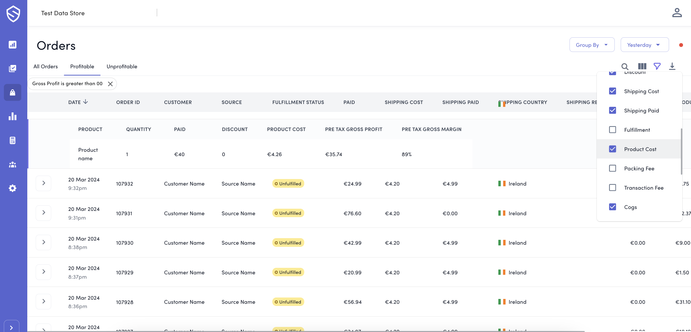
Comparing order-level and product-level profitability.
Understanding which products in your order are profitable and which are not is crucial for running a sustainable e-commerce business. Often, businesses focus solely on revenue without considering the true cost behind each product sold.
Factors like taxes, shipping, discounts, transaction fees, and the product’s manufacturing or procurement costs can significantly impact the profitability of each order. Make sure to consider this when you create your promotional strategies on your product page.
With these tips, you’ll be ready to not just survive Q4 but thrive—growing profits, not just revenue
Now, let’s be honest. With so many events happening in Q4, who has time to analyze every order manually? If you want to make smart decisions faster with data at the centre of it and being profit-first mind, book a demo and start your StoreHero trial and get ready for this high season!


